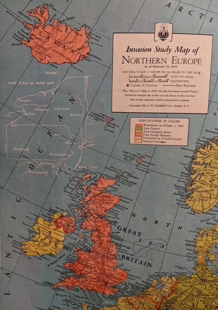
This map, from the Matthews-Northrup Global Atlas of the World at War (1944), has an interesting connection between my interest in comparative area symbols and wartime strategic atlases. As an example of the latter, the Global Atlas is not all that impressive. It contains mostly flat, stock reference maps without much compelling visualization of the ongoing war. But the “Invasion Study Map of Northern Europe,” does have an intriguing feature. In the ocean between Iceland and Scotland there is an outline map of New York, Pennsylvania, and New Jersey to serve as a key to understanding the comparative area. It is not quite the same as the comparative area symbols from 19th century geography textbooks, about which I have posted so much, but it is essentially the same technique. No other maps in the atlas have such a comparison.