I’ve written a couple of posts about Jacques Redway, and I remain intrigued about what the full story of his life and work might contain. But as I collect more and more of Redway’s later work, I am getting the impression that his maps did not get better over time. Redway argued in 1892 that “American Maps are Bad” and I think that mass-market American maps generally got worse after he wrote those words. But did Redway’s own career demonstrate and represent that same drift towards uninteresting maps?
Redway was publishing some inventive maps around the time of his 1892 argument. Redway was the author of Butler’s Complete Geography (first published in 1887), which uses many of the same comparative techniques used by James Monteith.
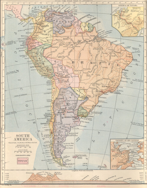
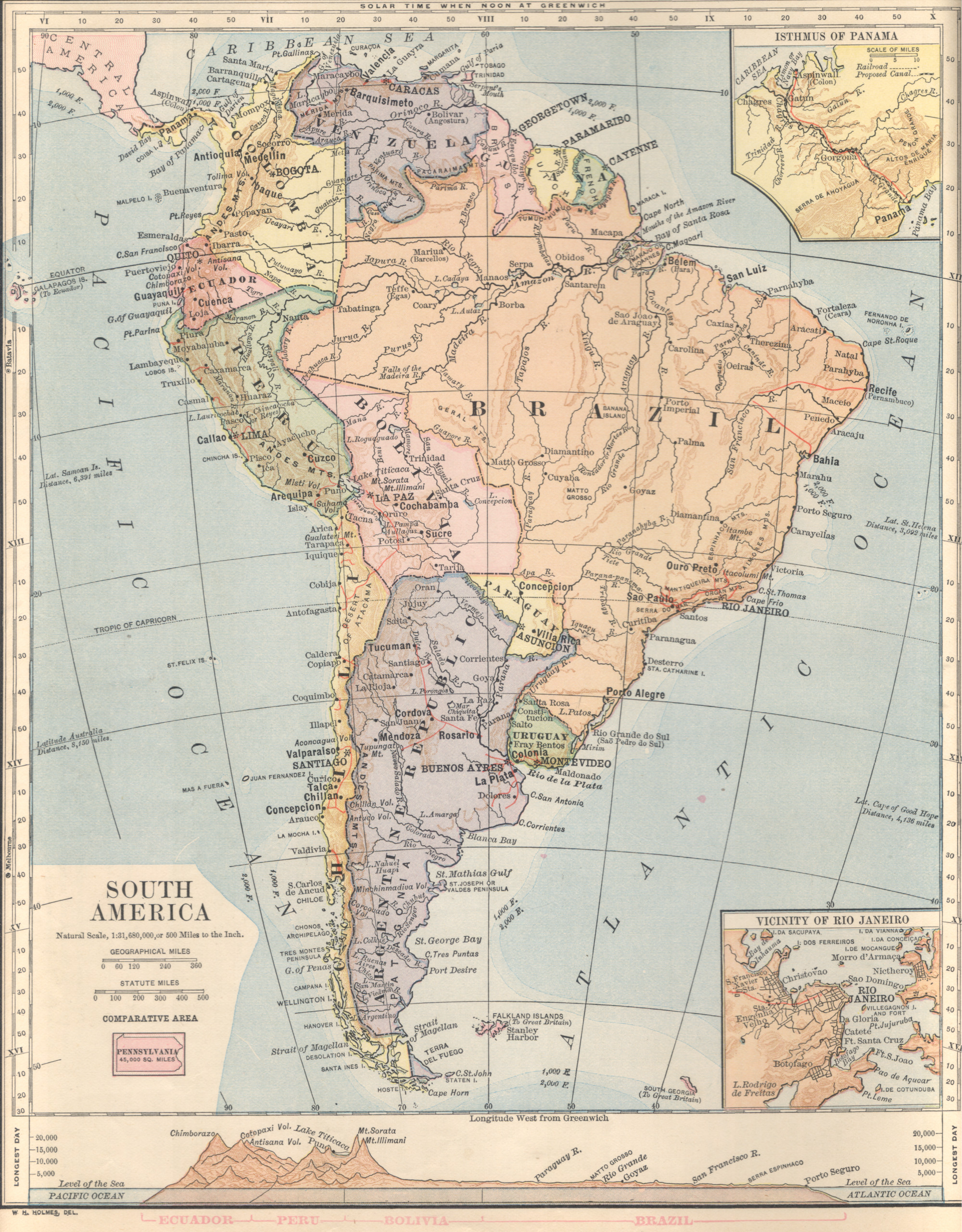
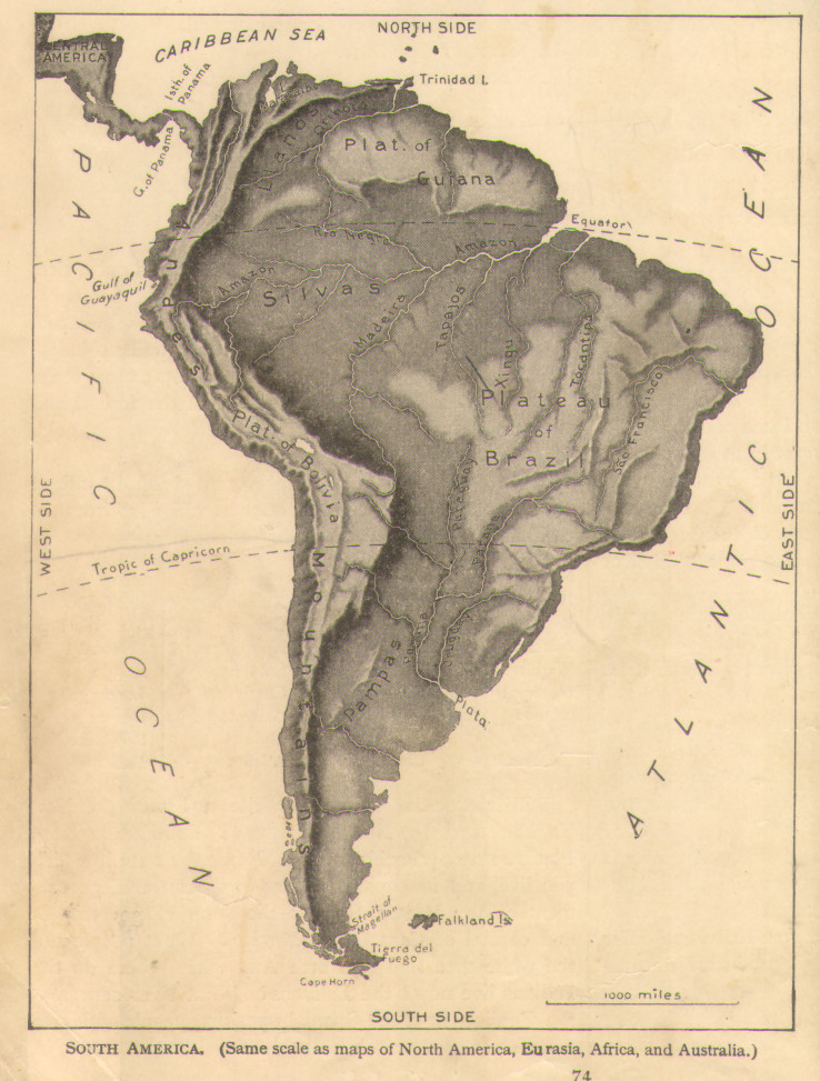
A decade or so later, some of the inventive techniques were starting to fade away. Comparing two Redway textbook maps of South America below, the first one circa 1890 and the second circa 1901, the full sheet map of South America has lost some adornment. The first map includes a comparative area symbol (Pennsylvania), a terrain cross section, and blue tints to show basic bathymetry. The later map loses all of these elements, while adding more inset city maps. The later map includes continues to include annotations of distant cities at the same latitude, but removes the faintly noted comparative extent bars included in the early map (these bars fell outside the width of the scanner but are visible in the detailed images in my other Redway posts).
Another two decades later the trend continued: the 1921-1925 Redway and Hinman Introductory Natural Geography is full of flat, unannotated and lifeless maps. In some ways, these maps are starting to look like the insipid atlas maps so common in the late 20th century. This edition also continues a trend toward printing separate physical and political maps, to reduce the amount of detail each map had to portray. The relief map is compelling in a way, and there is an attempt at comparing different areas by printing maps at the same scale. But with these maps appearing dozens of pages apart in the book, the comparison is not effective.
One possible explanation for the shift between the maps of the 1890s and what came in later decades is that it wasn’t about Redway at all. Redway praises “W.H. Holmes” for drawing the maps in the earlier volumes, but Holmes is not credited in the later volume and the drawing and engraving are attributed to “E.Y. Farquhar, Del.” Perhaps the issue was that W.H. Holmes was the real innovator and he wasn’t drawing the maps anymore.
W.H. Holmes is another cartography mystery for another time. He was making some impressive maps as early as 1859 and contributed to a number of other textbooks: his maps appeared in Samuel Mitchell’s atlases before Redway’s textbooks. He is definitely different (and a good deal older) than the more famous William H. Holmes (1846-1933), and artist, explorer and senior official with the US Geologic Survey.